 Richard's Blog
A Sütterlin practice booklet: one letter per page
What the booklet is#
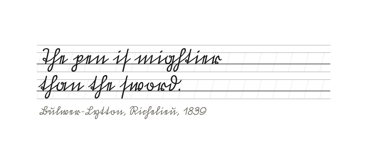
Thirty-four pages of DIN A5 portrait that between them cover the whole Sütterlin alphabet of the 1911 cut. The composition is the same on every sheet, so the book can be opened anywhere and still be understood: a cover sheet carrying the measurements and the page index, a sheet that asks for your name in the same hand, twenty-six letter pages from a and A to z and Z, one page for ß, four pages for the digits 0 to 9 together with the two sign glyphs @ and &, and a blank page for writing of your own.
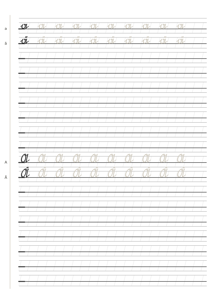
A letter page takes one letter and nothing else. Eighteen ruled lines stand on the page. The first line from the top carries the lower-case form ten times, the tenth line the capital ten times, and every row begins with a single black glyph followed by nine in a light tracing grey. On the pages whose letter takes an umlaut — a, o and u — two further rows stand directly beneath: the umlaut lower-case on the second line, the umlaut capital on the eleventh. The ß page holds two rows of ß in writing size, because this cut has no capital form of it.
What it is for#
The booklet exists so that the old hand can be practised without a course book lying open beside it and without ruling a page first. Everything that would otherwise have to be remembered — where the line begins, how high the middle band is, where the pen is set down, which letter follows — is printed on the sheet, and the sheet only asks to be written on.
The black glyph is a starting point, not an ornament: the pen is placed on it, the grey row is traced over, and the empty lines beneath are then written from memory. That order is the whole method. Tracing gives the hand the shape; writing from memory shows whether the hand kept it. A page is finished when the free lines can be filled without looking at the row above.
Worked through in short daily sessions over roughly thirty days, the book is meant to raise writing speed while legibility stays where it is. Both halves of that aim can be measured with the book itself: copy a continuous text of a hundred and twenty words for two minutes and count the characters per minute, then let someone who has never seen the hand read a passage and count the misreadings per hundred characters. Speed that arrives at the cost of legibility has not arrived.
It is a practice aid, not an alphabet book. It teaches the shapes of one cut — Sütterlin as it was drawn in 1911 — and it assumes a broad-nibbed pen and the patience to write the same letter twice.
How a page is built#
The ruling follows the 2:3:2 band rule, and the pages are laid out for a 1.1 mm nib. At that width the middle band is 4.40 mm and the written height 3.46 mm of it; the descender reaches exactly as far as the outer line of the lower band, so a letter that runs past that line is too large rather than badly placed. Eighteen lines fit the page with the block running from 12.60 mm to 197.40 mm, so the lower margin is as deep as the upper one.
The guide lines stand at 76.5° to the baseline and only inside the writing band; the band above stays white. They are drawn so pale that the paper keeps reading white under the pen. In the left margin the page carries three quiet marks: the letter being practised, a short stroke showing where the pen is set down, and the margin line itself.
How the pages are used#
- Letter pages. Trace the lower-case row in the first line and the capital row in the tenth, then write both again on the empty lines beneath. Work one letter per sitting and turn the page only when the free lines come out without looking up.
- Umlaut rows. On the a, o and u pages the two rows under the main rows are used the same way, so ä, ö and ü are learned with the letter they belong to rather than as a separate lesson.
- Digit pages. The twelve signs 0 to 9, @ and & take four pages instead of twelve. Each page is divided into three blocks of three lines: the top line of a block is a tracing row for one sign, the two lines under it are empty and ruled for writing that sign yourself.
- Name sheet. Name, street, city, telephone and e-mail are fields to be filled in Sütterlin on the ruled lines, so the page that leaves the house is written in the same hand as the practice pages.
- Blank page. For your own text once the letter pages are done, and for the reading test described above.
Printing and the gauge#
Print at 100 percent with no scaling, on A5. The cover sheet carries a gauge between 13 and 63 mm: measure that distance, and if it comes out 50 mm the print is true and the bands are the size they claim to be. The writing pages are deliberately clear at every edge — no header, no footer, no line numbers, no gauge — so that nothing on the sheet competes with the line being written.
Two languages#
Two language editions are built from the same run: German and English.
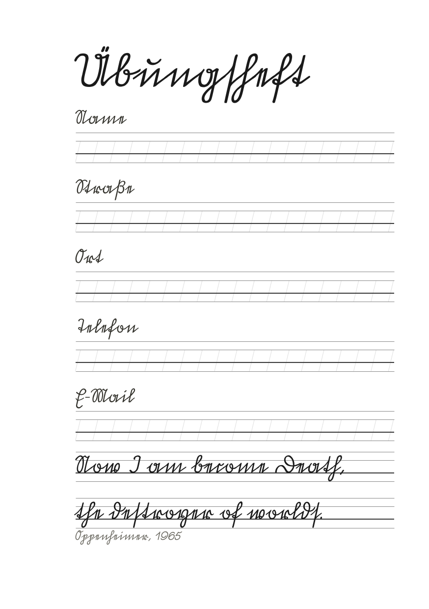
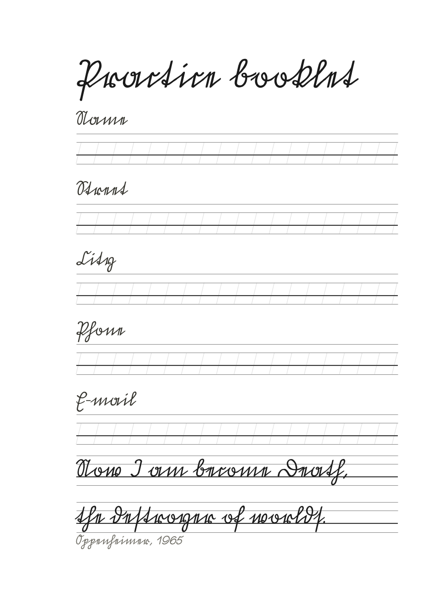
One writing page, shared by both editions: the traced row in the first line, the capitals in the tenth, and the empty lines under them.
The typeface, and the terms it comes with#
Every glyph in the booklet comes out of one font file: Suetterlin HJZ 1911 Italic by Hans J. Zinken, his digitisation of a Sütterlin cut of 1911.
Author's page: zinken.net/Fonts/Suetterlin.html
Direct download from the author: Suetterlin-HJZ-Italic_1911.ttf (font/ttf)
The terms are the author's own words on that page: „This font is freeware and can be used either for private or for professional purpose." The copyright record inside the file reads Copyright (c) 2017 by Hans J. Zinken. All rights reserved. The typeface remains his property; this booklet claims no rights in it and grants none.
License#
Feel free to download these files, print them for your personal use, but if you want to distribute them, please credit me and Hans J. Zinken as source. Also send me a quick message for approval.
Have fun practicing!